How to choose art for your living room: A photographer's guide
There's a moment every photographer knows — the one where the light hits exactly right, the composition clicks, and you think: that's it. That's the feeling a great piece of wall art should give you every time you walk into a room. Not decoration. Recognition.
But choosing art for a living room is something most people find genuinely difficult. Too small and it disappears. Too busy and it competes. Too safe and it just... sits there.
I photograph the world with an architect's eye — drawn to structure, geometry, and the way light defines space. Over the years I've noticed that the principles behind a strong photograph and the principles behind a well-designed interior are the same ones. Here's how I think about it.
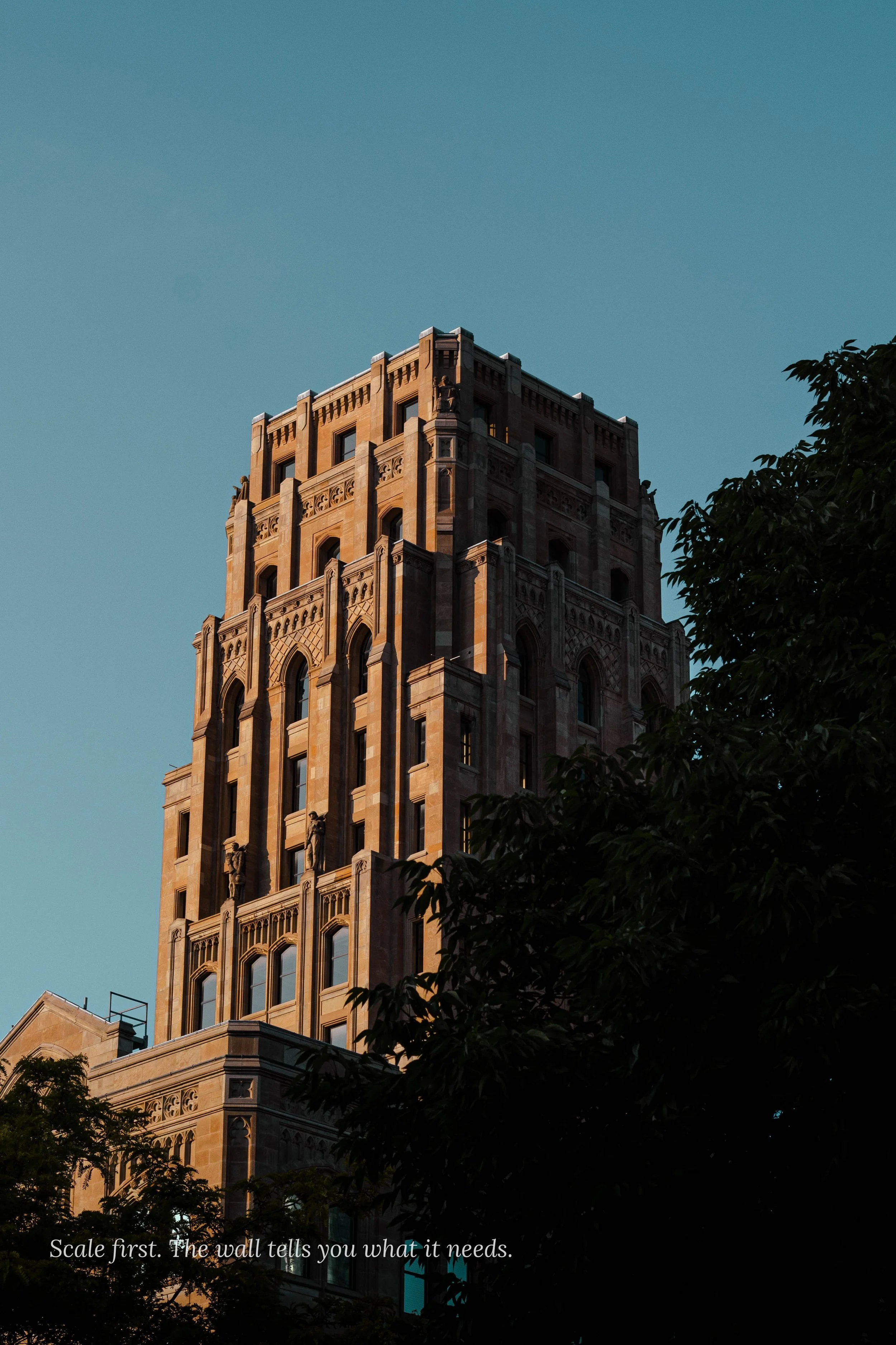
Scale is the first decision, not the last
Most people choose a print they love, then figure out where to put it. Do it the other way around. Start with your wall.
A print that's too small on a large wall doesn't read as modest — it reads as unfinished. As a rough guide: your artwork should occupy roughly two-thirds the width of the furniture beneath it, or two-thirds the wall if it's hanging alone. For a standard sofa (around 200cm wide), that means looking at prints from 60×80cm upward. My most popular sizes — 70×100cm and 60×90cm — were chosen specifically because they hold presence in a modern living room without dominating it.
If in doubt, tape out the dimensions on your wall before you order. It takes two minutes and it will save you from the most common mistake people make.
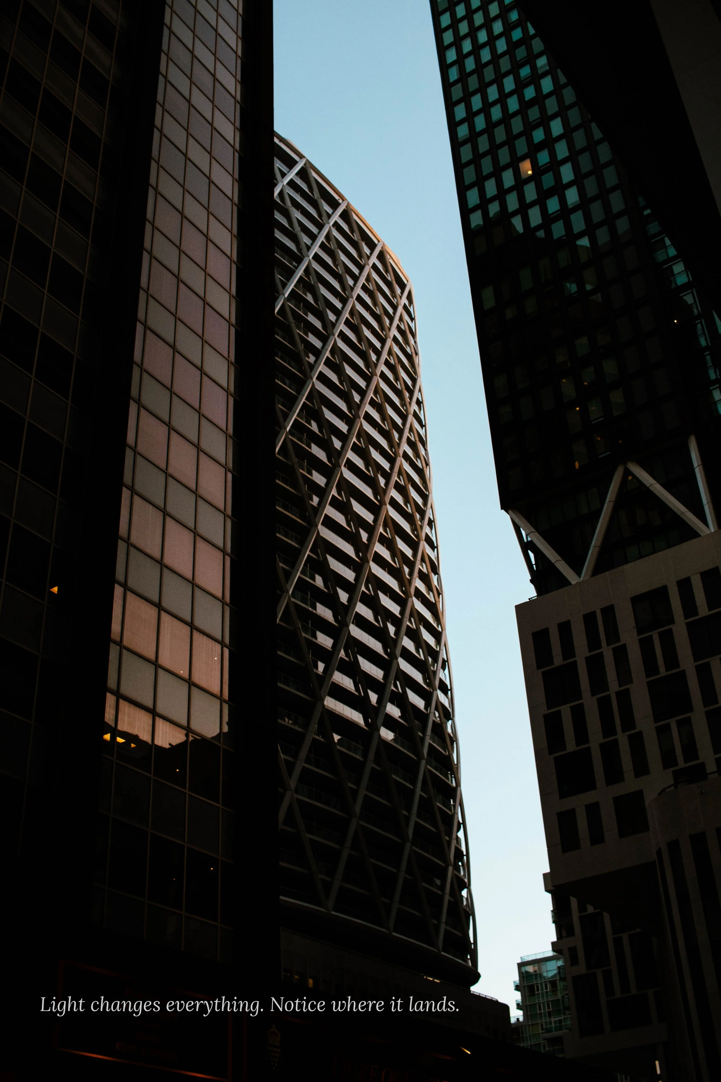
Light changes everything
A print that glows in a gallery can look flat at home, and a subtle photograph can come alive in the right natural light. Before you choose a piece, spend a day noticing how light moves through the room. North-facing rooms tend toward cool, diffused light — they suit prints with strong tonal contrast or cool palettes. South and west-facing rooms get warm afternoon light that can wash out delicate tones but makes rich, saturated images sing.
My prints are produced on fine art paper specifically chosen to hold detail across a wide range of lighting conditions. But placement still matters. Avoid hanging directly opposite a window where glare will fight the image. Slightly off-axis — even by a metre — makes a significant difference.
One focal point, not a gallery wall (to start)
Gallery walls are having a moment, and done well they're beautiful. But if you're starting out, there's a strong case for one considered piece over five smaller ones. A single large-format print does something a collection of smaller works can't: it settles a room. It gives the eye somewhere to land.
The prints I make are designed with this in mind. They're meant to be the thing you notice first when you walk in — and the thing that reveals more detail the longer you look.
Subject matter should connect to something real
The best art in a home isn't chosen because it matches the sofa. It's chosen because it means something to the person who lives there. A photograph of the Irish coastline resonates differently if you've stood on those cliffs. A street scene from Florence carries weight if that city shaped you.
That's why every print in my collection has a story attached to it — not as marketing copy, but because context is part of what you're buying. You're not just buying a image of Lake Como. You're buying a specific morning, a specific quality of alpine light, a moment that won't happen again exactly that way.
Neutral doesn't mean boring
One of the most common pieces of advice given about wall art is to "keep it neutral." The instinct is understandable — you don't want the art to clash with a future sofa or a repainted wall. But neutral and boring are not the same thing.
The most versatile prints tend to be those with strong compositional clarity — a clear subject, deliberate negative space, and a tonal range that works in both warm and cool environments. Black-and-white photography is reliably versatile for this reason, but so is colour photography with a restrained palette. The Cliffs of Howth print works in a monochrome Scandi interior and an earthy Mediterranean one — not because it's beige, but because the composition is confident enough to hold its own in either.
A note on where to hang it
Height matters more than people think. The standard rule — centre the work at eye level, roughly 145–150cm from the floor to the midpoint of the print — exists because it works. In dining rooms where people are seated, go slightly lower. Above a sofa, leave 15–20cm between the top of the furniture and the bottom of the frame so the piece feels connected to the room rather than floating.
For hallways and entryways, consider the sightline from the front door. What does someone see the moment they step inside? That's prime real estate for a print that says something about who lives there.
If you'd like to see how the prints look at scale, every piece in the shop is available in multiple sizes — and I'm always happy to advise on what works for a specific space. Browse the collection →